Problem:
Many Muslim youth face barriers to practicing their faith—limited knowledge, competing priorities, and a sense of disconnection. As a convert who’s experienced these struggles, I brought empathy and lived insight to shaping the problem.
Goals:
• Provide a space for Muslims where they will feel understood, motivated, and connected while working on their spiritual journeys.
• Empower what is, right now, an underrepresented group within the current technology ecosystem.
• As a small company, we set a modest goal of 1000 downloads for our initial launch.
Timeline:
• We aimed to have the app release just before Ramadan; a holy month of prayer, community, reflection, and self-improvement.
Tawhid began as a passion project. Competing commitments and the challenges of building a company from the ground up extended our timeline. The dates shown here don’t fully reflect the time required for a complete end-to-end design process.
My Role:
I was the first designer hired on the project. As the company expanded, I took charge of a small multidisciplinary team of 5 which included developers, marketers, and two other designers. I also worked closely with our founder.
Tools and Framework:
For this project I followed the Design Thinking Framework: Emphasize - Define - Ideate - Prototype - Test.
As for tools, I primarily used Figma, with additional work done with the Adobe Creative Suite.
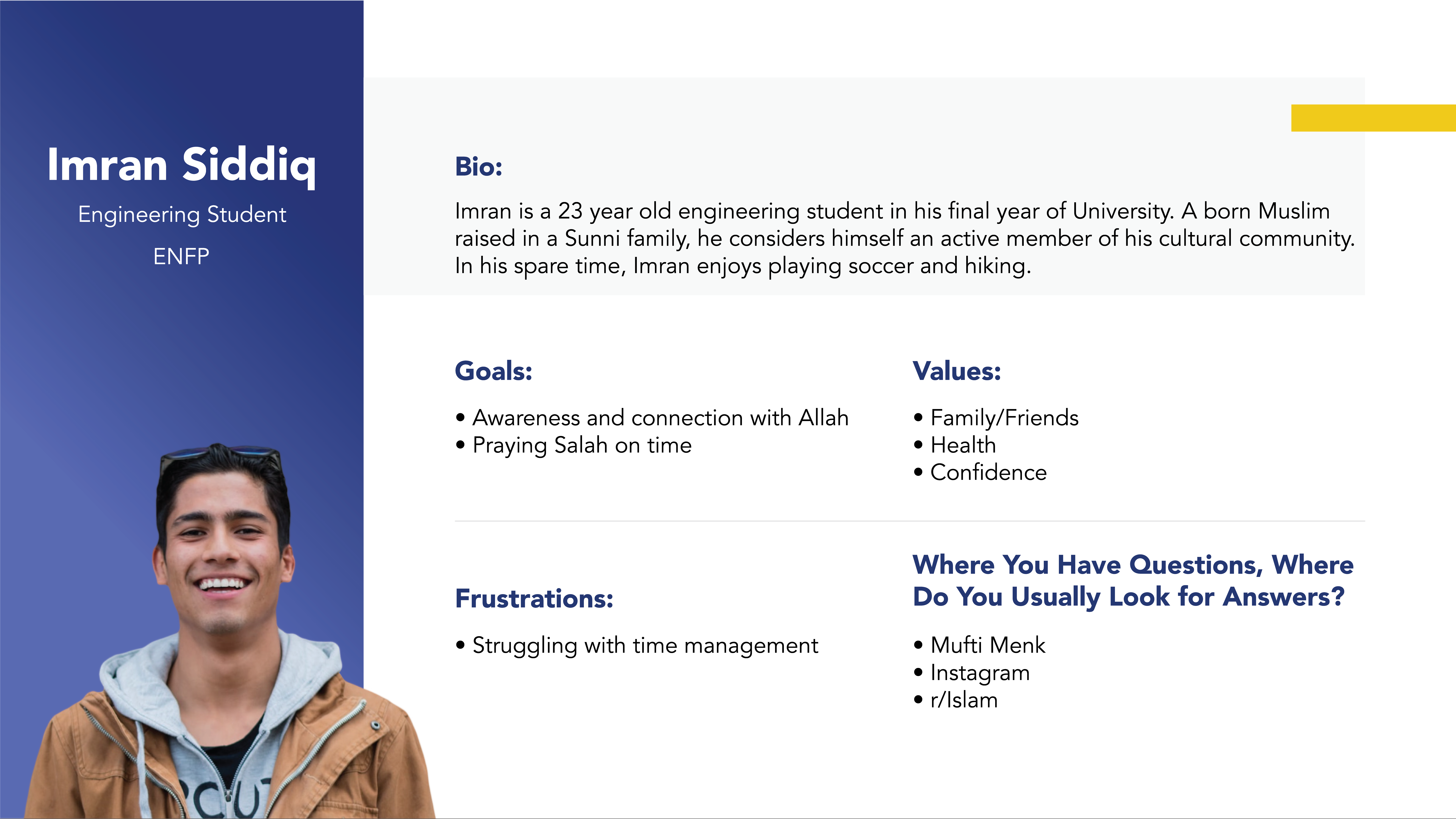
While we had a general understanding of the challenges Muslim youth face, we recognized that experiences varied widely—different factors contribute to the struggles identified in our initial interviews. Using the insights gathered, I grouped common themes to create our initial personas, including students and converts. These personas helped shape how tasks were structured in the app.
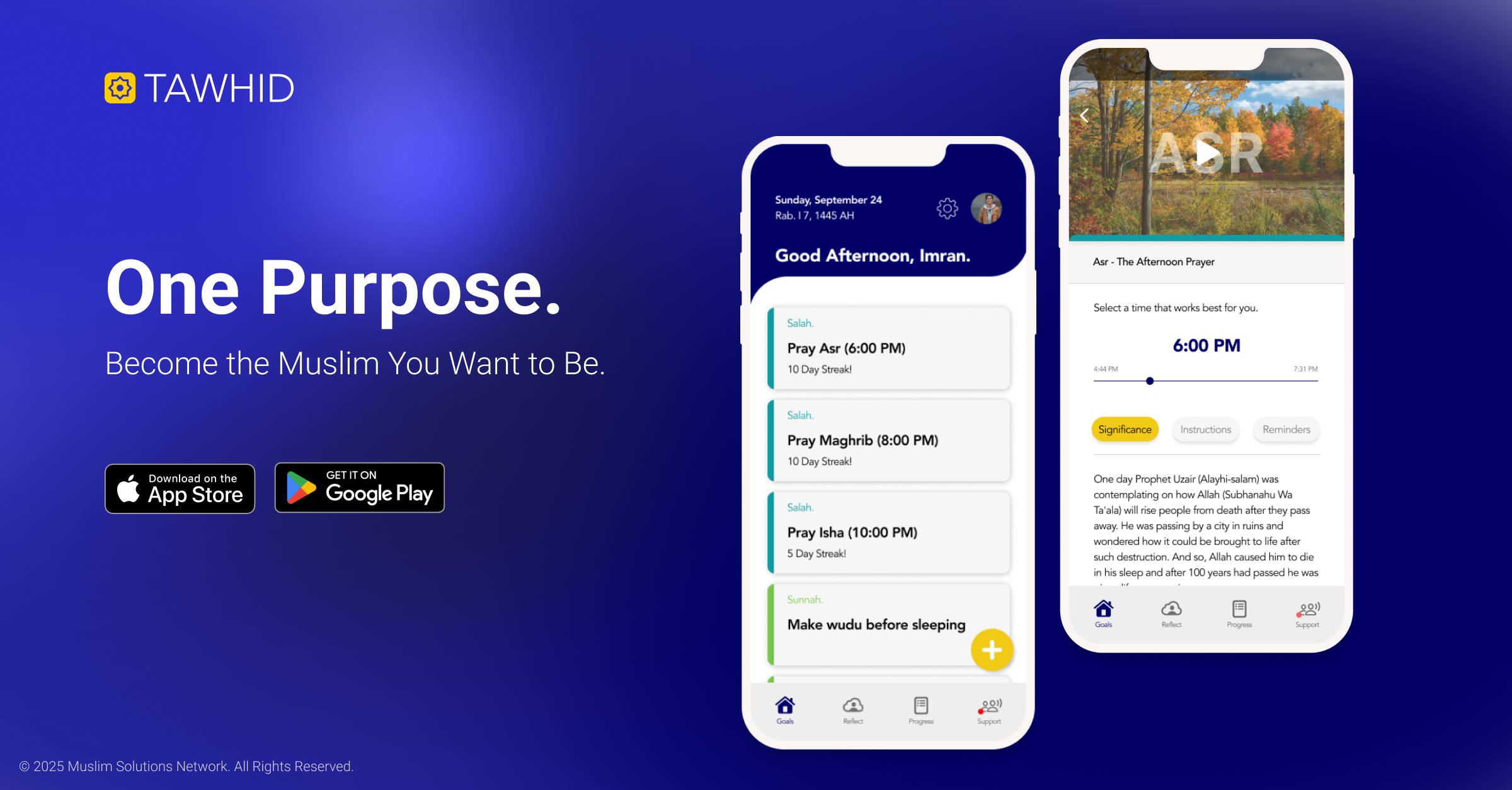
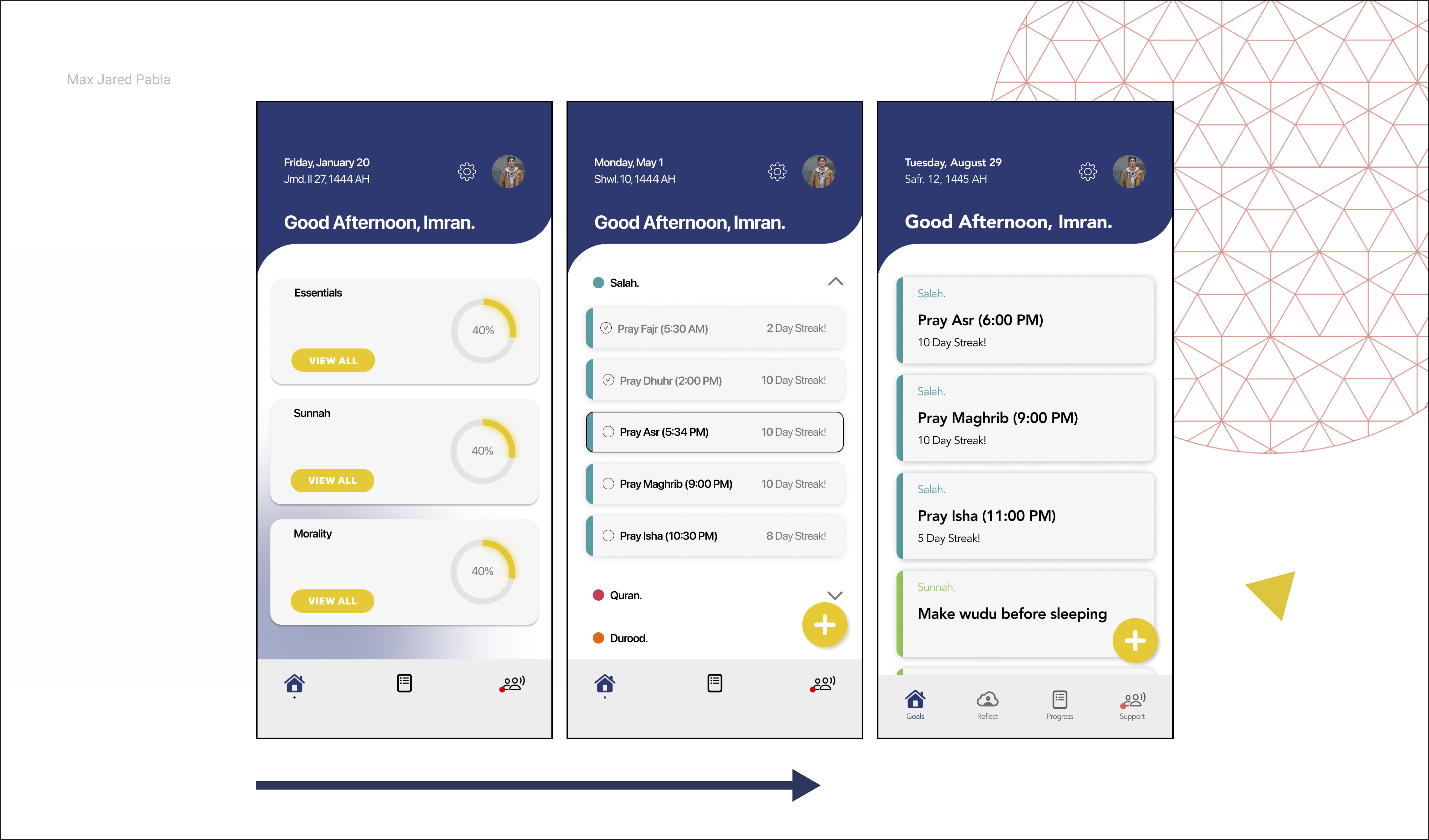
For example, one persona, Imran, a university student, struggled to balance prayer with academic and personal responsibilities. To address this, we allowed users to select their preferred prayer time within the general period (e.g., sunset prayer between 9:00–10:30 PM) and sync it with external calendars. This flexibility supported students and others with inconsistent daily schedules in managing their religious obligations.
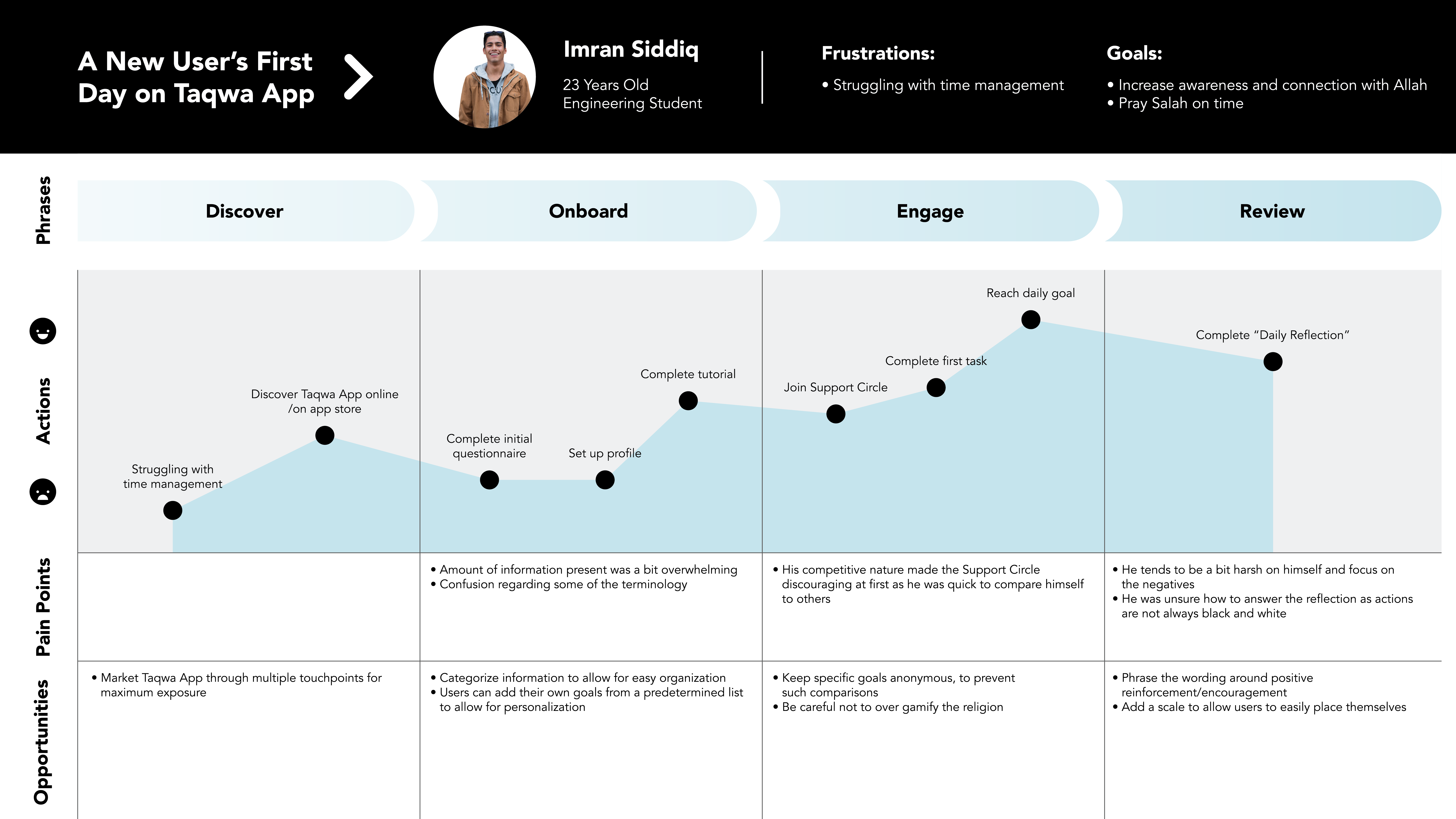
We also created a journey map to visualize a new user’s experience from discovery to completing their first day. The onboarding tutorial was a critical touchpoint: since the app’s structure differed from other Islamic apps, it was essential that users could quickly grasp its functionality. At the same time, we avoided making the tutorial too long or cumbersome, balancing clarity with engagement.
Another key consideration was gamification. We wanted users to feel motivated and rewarded without compromising the app’s primary purpose: fostering a stronger connection with God. This meant limiting competitive elements—while community and friendly competition were encouraged, the app prioritized meaningful engagement over “internet points” or quick dopamine hits.
Market research further validated our design approach and inspired a renaming of the app. Initially called Taqwa, we discovered other apps with the same name. We rebranded to Tawhid, reflecting the oneness of God while preserving the app’s goal of helping users cultivate a meaningful spiritual practice.
After defining early aesthetics, I built a Figma prototype to test features, validate concepts with stakeholders, and communicate flows and visuals to developers.
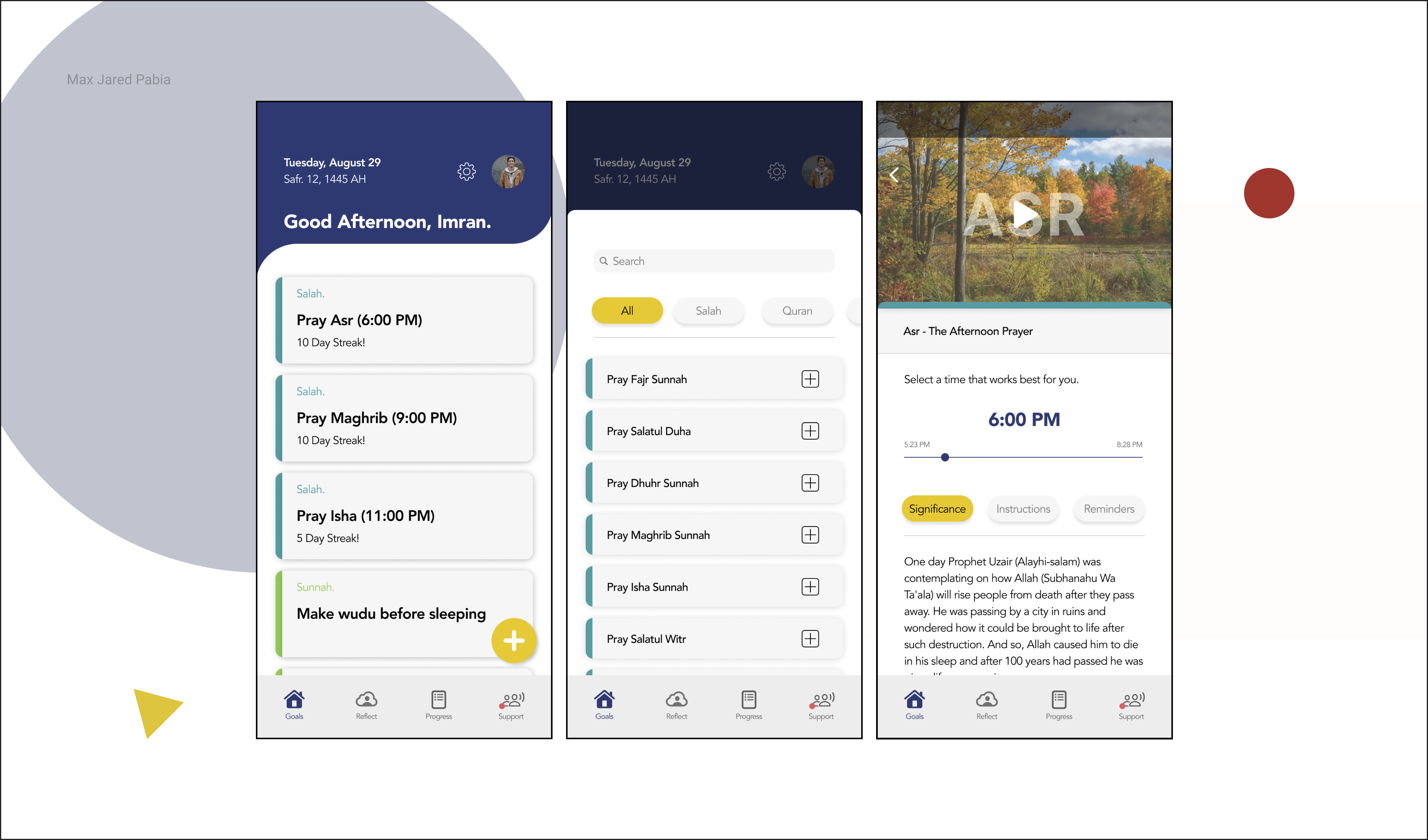
I ran usability sessions to uncover what users loved and where they struggled. One major insight: our information categories were confusing. Essentials was broken into smaller sections, letting users find what they needed quickly, while Morality was renamed Reflection after testing revealed the original term was unclear.
The Reflection section encouraged users to review daily actions according to Islamic guidelines. We rephrased prompts to focus on positivity—for example, changing “Did I avoid evil?” to “Did I do what is right?”—and added a scale to capture nuance, recognizing that actions aren’t always black and white.
Finally, we repositioned Reflection in the navigation bar. Its purpose differed from other tasks, and keeping it on the home screen risked user confusion or neglect.
Through these iterations, we balanced clarity, engagement, and meaningful interaction, ensuring the app guided users toward their spiritual goals without friction.
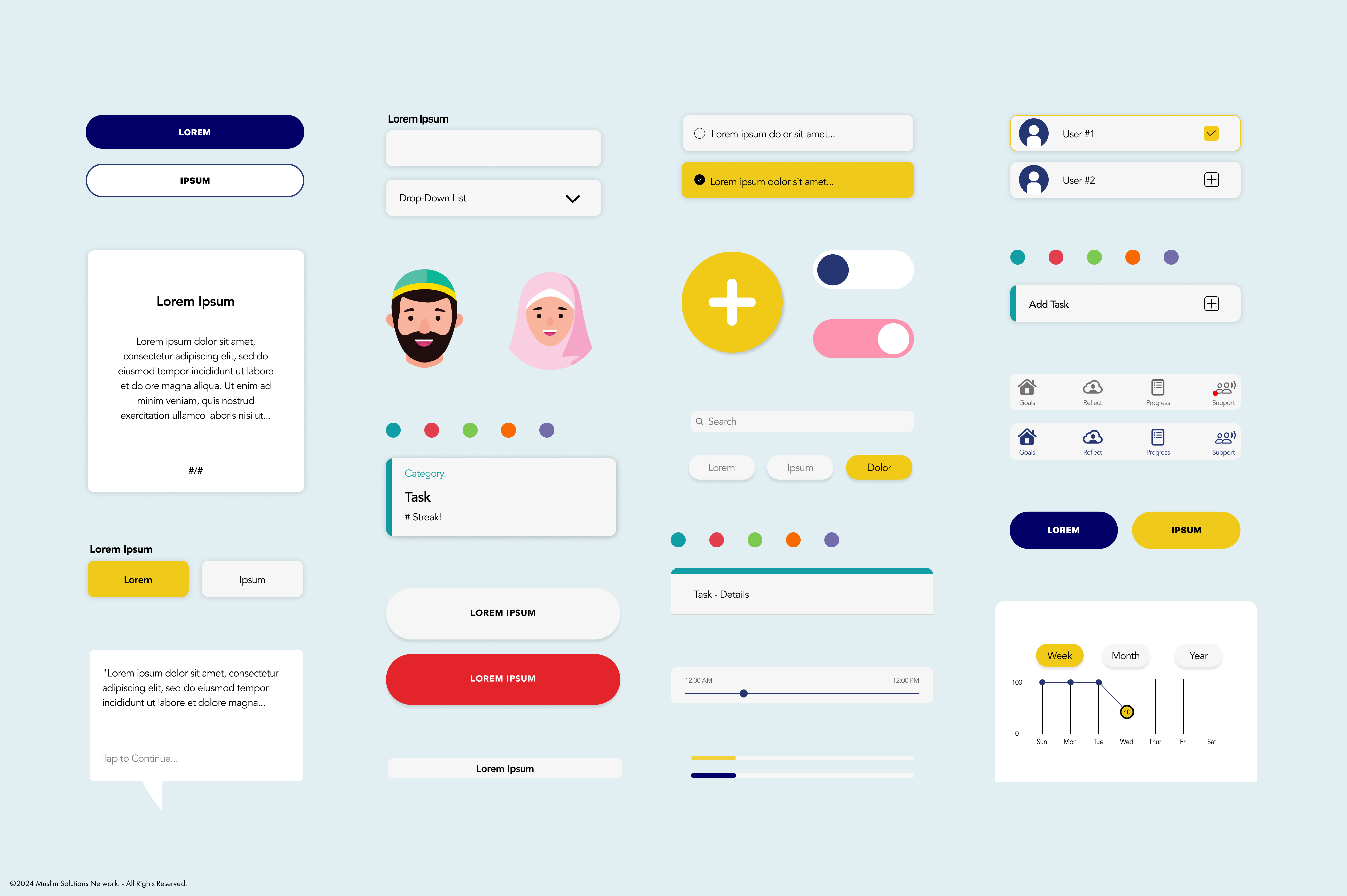
With a wide range of tasks and personalized user journeys, the app spanned many screens. To keep the experience consistent and simplify development, I built a comprehensive design system using templates and reusable components. Every element shown here was crafted by me—except for the two faces, which were brilliantly designed by my teammate, Dushyant!
Challenges:
As a junior product designer transitioning from graphic design, one of my biggest challenges was aligning with developers. While I understood the general concepts, I hadn’t worked on a project of this scope before. I quickly realized that iteration is easier in design tools than in code. I also struggled with pixel-perfection—relentlessly comparing the final product to the Figma file. In graphic design, this mindset makes sense; for example, a poster must print perfectly. But as Jake Albaugh from Figma says, “Perfect code is aligned to design intent, not pixels.”
Technical feasibility was another hurdle. Features needed to fit the company’s budget and be implementable by developers. We addressed this by defining a Minimum Viable Product (MVP) and expanding the app’s capabilities only once the basics were solid. Clear vision and scope control prevented unexpected project creep. Another smaller, but related challenge was ensuring developers had access to the same fonts and visual assets I used.
Learnings:
A key takeaway is to involve developers early. Design and code are inherently different practices, but early collaboration uncovers opportunities and limitations before changes become difficult. This also helps establish design patterns sooner. For future projects, I plan to refine Figma component properties to better emulate code—defining props, boundaries, instance swaps, and variables to improve alignment between design and development.
Results:
Tawhid launched in March 2024, exceeding estimated downloads by 180% and achieving a 4.8 App Store rating. It has been featured on CBC, Yahoo News, and Calgary Tech.
Launching is just the beginning. Next steps include tracking and analyzing metrics to evaluate impact, identify improvements, and prioritize future updates. I’m excited to see how Tawhid evolves in the coming months.
For more information, visit tawhid.app.

