When I joined On A Dime Transformations (OAD) back in 2021, they had a vision with years of high quality research to support it. But beyond the basic idea for a logo and some icons, there wasn't a consistent visual identity bringing everything together. This led to the founders putting out a job posting for a designer.
My Role:
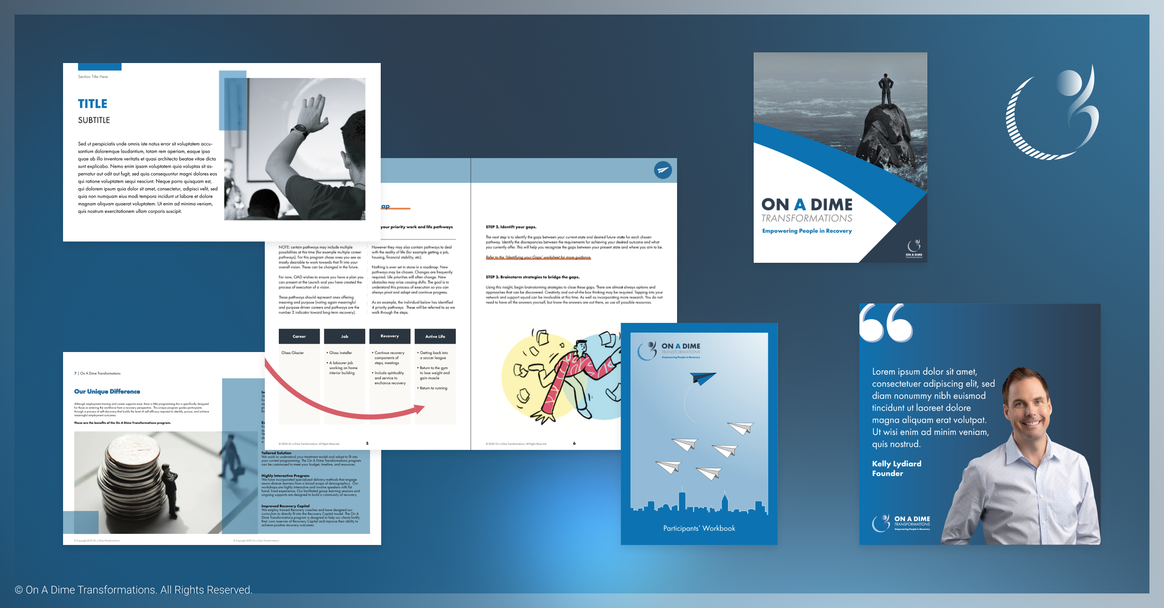
To develop and establish the visual identity for a new startup company, as well as implement it across their various products and services. This role included drafting a brand brief and reusable templates for use across the organization.
The first task assigned to me was updating the logo. The concept was already there, inspired by a story the CEO heard about the founder of Second Cup. I was given the original design, as well as the key themes they wanted to portray: transformation, infinite journey, human-centered.
Beyond visual decisions, emphasis was to be placed on accessibility to accommodated for neurodivergent participants and users with education gaps. This led me to conduct research primarily around colours and fonts. It wasn't entirely apparent for back then, but as I progressed in my career one thing became clear: Accessible design is good design. Not just for people with disabilities, but for everyone.
Key Findings:
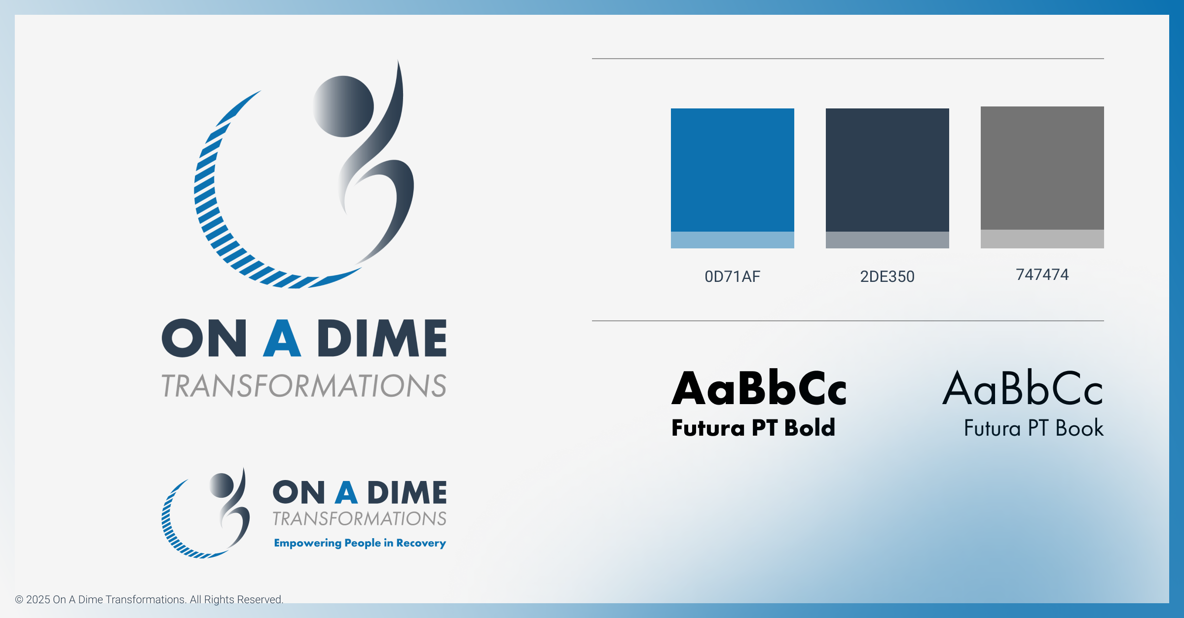
• Colour contrast should be sufficient enough to different between backgrounds and text. I opted for a bare minimum of 4.5:1 in accordance to the WCAG(Web Content Accessibility Guidelines). Tools such as Colorable has been indepensable for this.
• Sans Serif fonts are easier to read for neurodivergent individuals due to their clear and simple letter forms.
Based on all this, I settled on Futura PT. Letter proportions were even with easily recognizable characters to aid readability. Futura PT is also a web font meaning it will adapt and be displayed properly on any browser.
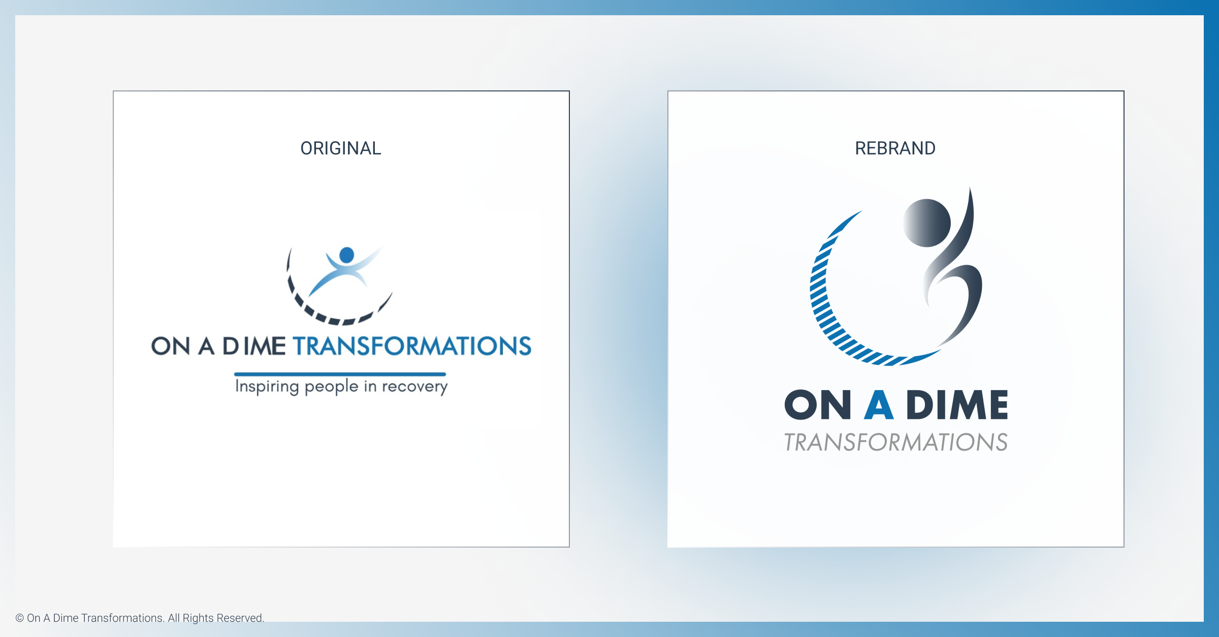
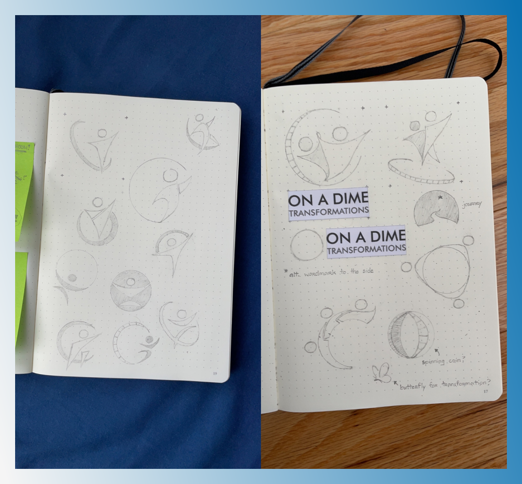
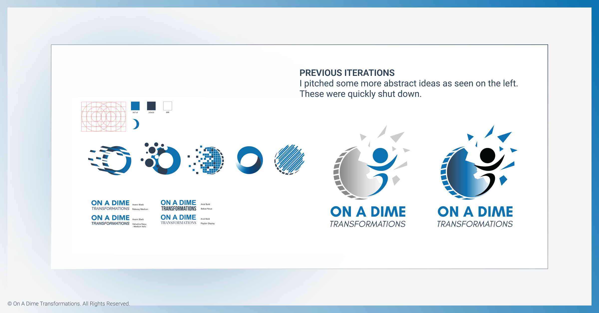
“Our logo pays homage to the story of transformation. The logo shows a person transforming through a dime. The individual is reaching upward, and the stance is of a strong, humble warrior.” This was the description of the logo outlined in the creative brief, and what my design was to be based on. The image of the man, as well the dime were elements that the founders insisted on keeping. How they were depicted, however, was completely up to me. I tried to pitch some more abstract ideas as well. These, however, were quickly shut down.
Iconography was another important aspect of On A Dime's visual identity. Icons are used as visual cues for better comprehension. They help support the structure, routine and sequence that most neurodivergent learners require. Icons are also used to ease navigation, allowing participants to break text into digestible chunks and easily find and remember certain sections.
We initially had three main icons, one for each key phase of OAD's flagship program. I decided to expand on this based on the multiple types of exercises that can be found throughout the curriculum.


With the visual identity ready to be implemented, it was time to begin work on the program itself. Staying true to your brand goes beyond just choosing the right colors and logos. It’s fundamentally about the story you choose to share and the way you convey it. Collaborating closely with the Director of Program delivery and an instructional designer, my job was to convert the research they've conducted into an engaging and interactive format. All while maintaining the guidelines and design decisions I've outlined here. Of course, these decisions are flexible and will continue to change and adapt as the brand grows. As of recently, we have included the colour orange in our colour scheme.
To learn more about the next step, please visit: https://max-pabia-portfolio.webflow.io/case-studies/on-a-dime-transformations