.png)
Problem:
After completing a recovery program, individuals often face intense feelings of regret over lost time and missed opportunities, while confronting the challenges ahead. Some respond by overworking in an attempt to make up for the past, while others feel paralyzed, unsure where to begin. Without significant support, this transition can lead to burnout or procrastination. Current recovery systems often overlook this critical component necessary for long-term success.
Goals:
Create a new program designed to bridge that gap. By helping participants explore their strengths, motivations, beliefs, and values, it empowers them to envision a hopeful and meaningful future. Employment readiness is central, giving participants the tools to reconnect with their authentic selves and build a path toward a fulfilling, impactful career.
My Role:
As the sole designer, I owned the visual direction from start to finish. I collaborated closely with an instructional designer and the Director of Program Delivery to refine content, while working with the founders to finalize the company’s visual identity.
All confidential information, such as participant names and details, have been omitted in this case study. Content present here is my own and does not reflect the views of On A Dime Transformations.
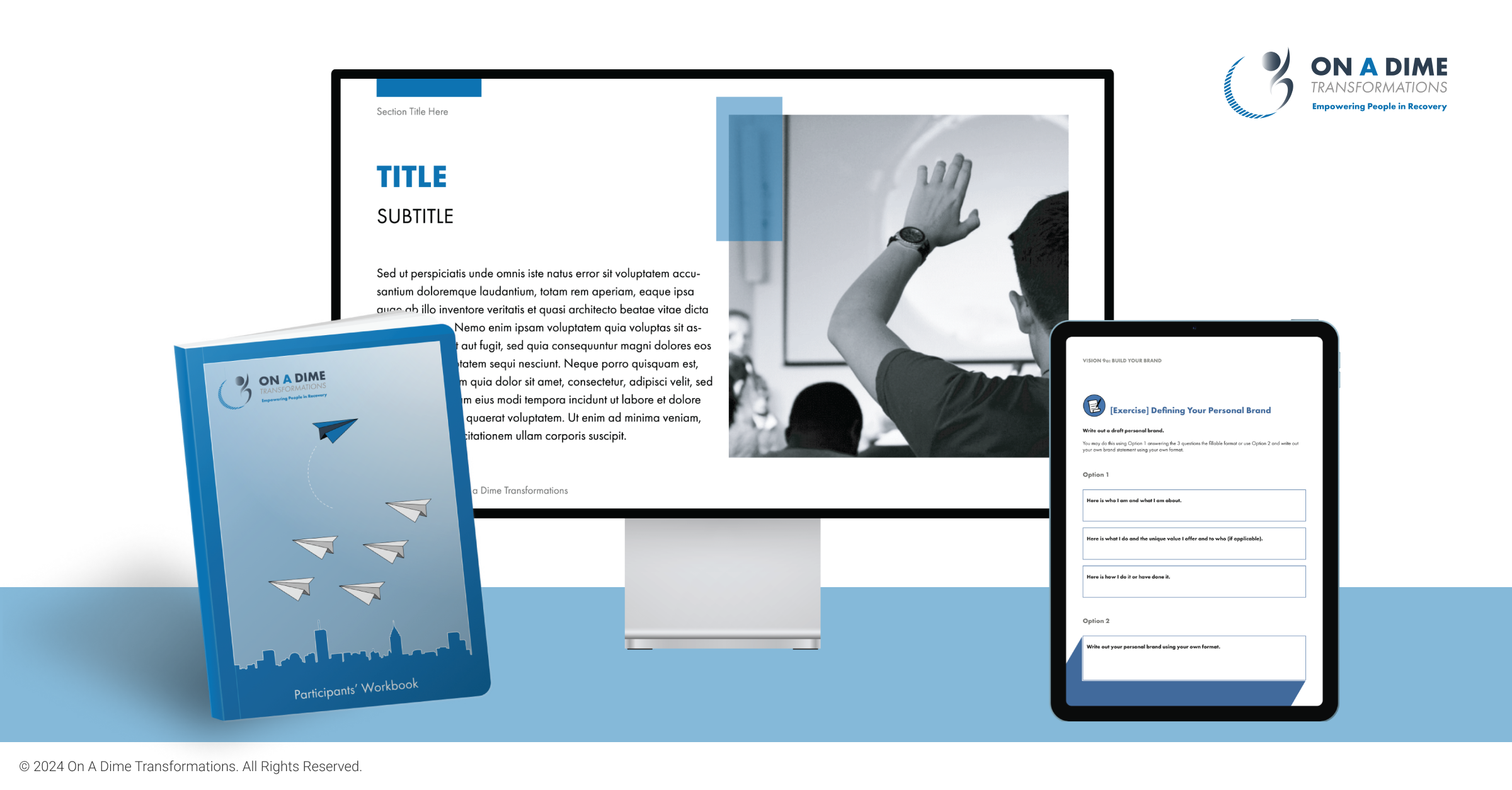
An interactive workbook, paired with its guidebook, served as the primary learning materials for OAD’s Career Discovery Program. The founders wanted a design that was concise yet impactful, with an emphasis on accessibility to support participants with educational gaps and neurodivergent learners.
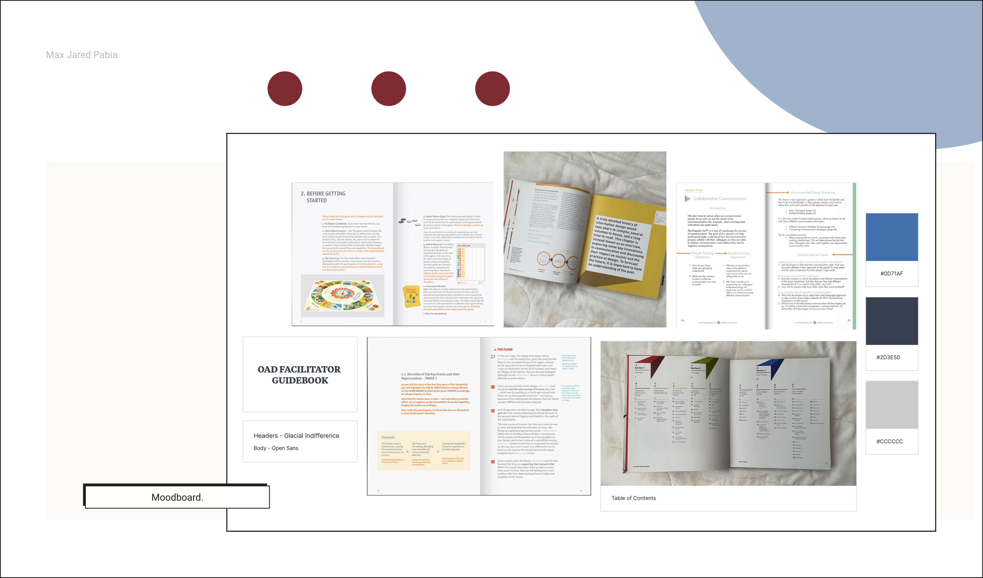
Working closely with an instructional designer and a team of facilitators, I translated their research into an engaging, interactive format. Inspiration was drawn from other interactive textbooks and online courseware, which I compiled into a mood board and presented to the company founders for initial validation.

Tools:
Adobe Creative Suite - InDesign (primary tool), Illustrator, Acrobat
The program was divided into three key phases: Hope, Vision, and Action. My first design decision when drafting the workbook was to implement a wayfinding system. I was handed a massive document filled with research, data, and curricula, and making it easy for participants to navigate became my top priority.
I color-coded each section to distinguish them clearly, extending the system to the edges of the physical book so users could quickly flip to a section even when it was closed. I also created distinct, reusable icons for the various exercises. For example, two speech bubbles signaled a discussion task, instantly cueing users to prepare talking points for their next group session.
One challenge was the use of white space. To make the content more consumable, I incorporated generous spacing to allow the material to breathe, improve scanning, and highlight key points. Some stakeholders were concerned that this approach increased page count and printing costs. By demonstrating the benefits of white space in readability and engagement, I successfully advocated for maintaining this design choice.
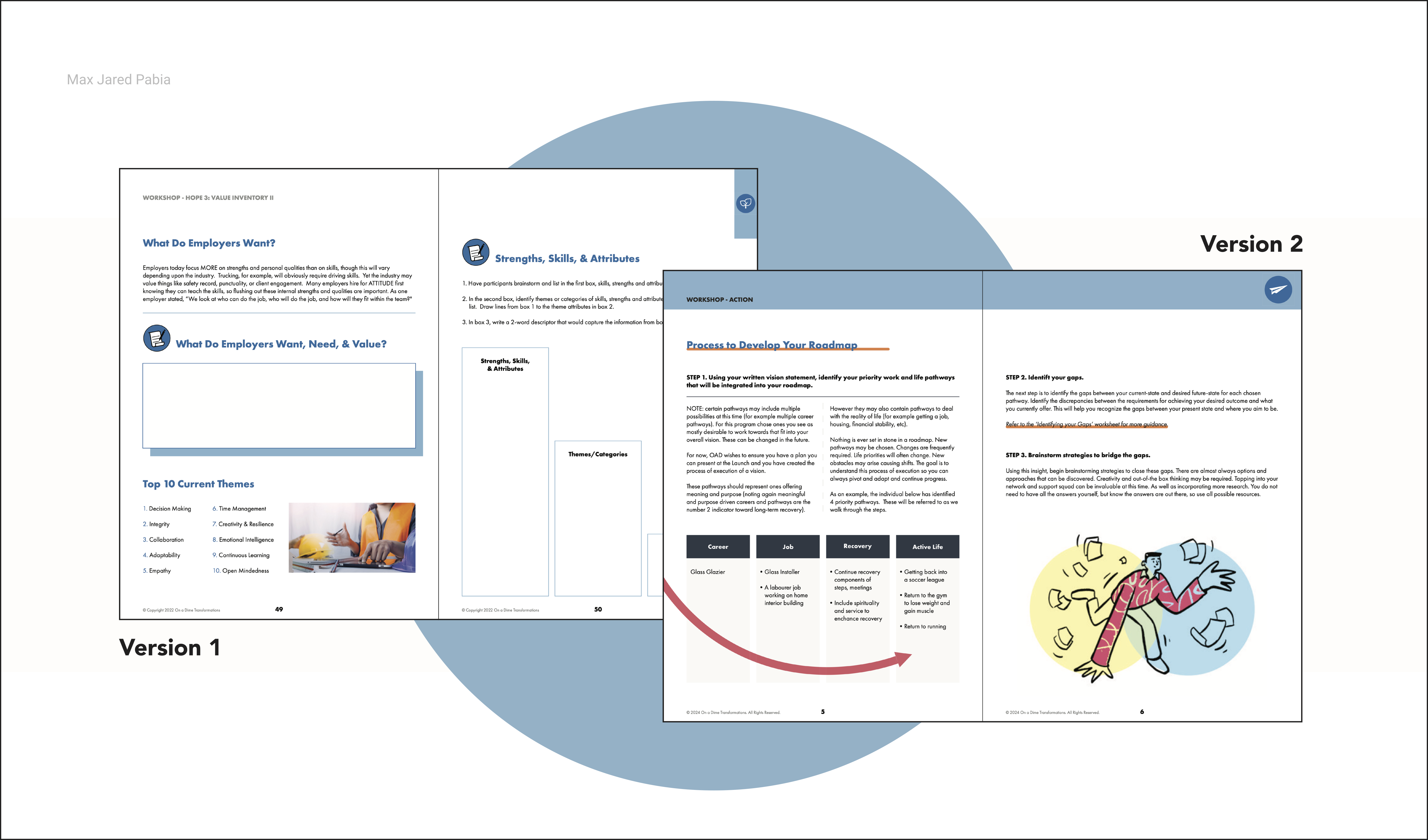
Ultimately, we split the content into three separate workbooks to make it easier for participants to carry to each session. This also freed me from the original color-coding system, allowing the full palette to be used across the books and creating a more visually engaging design.

Problem:
When the COVID-19 pandemic increased the demand for virtual classes, the project pivoted to an e-learning format. My main challenges were adapting previously released content for digital delivery, learning new tools like Acrobat, and managing a shrinking timeline.
Steps Taken:
To address these challenges, I researched and participated in online classes to understand the unique benefits and pitfalls of digital learning. Collaborating with our Program Designer and Director of Program Delivery, we adapted the content for the new format. The increased workload became overwhelming at times, so I prioritized planning, set clear personal goals, and established boundaries. Open discussions with supervisors and teammates helped us make compromises and keep the process smooth.
Additional Features:
The online format allowed us to introduce interactive elements such as fillable worksheets, facilitator videos, and searchable content, enhancing usability and engagement for participants.
Challenges:
While the online class met its objectives, it lacked the human connection essential for journeys like this. This realization led the team to settle on a hybrid program—third time’s the charm.
Learnings:
People Need People. Even the most polished e-learning experience can’t fully replicate the trust, motivation, and emotional support built through in-person interaction—especially in recovery-focused programs.
Designing for accessibility benefits all learners, not just those with specific needs.
Results:
Career efficacy scores rose by 48%, and 73% of participants were employed or enrolled in school within 30 days of completing the pilot. Today, the Career Discovery Program is used by five organizations across Alberta, including The Mustard Seed, Simon House, and Our Collective Journey.