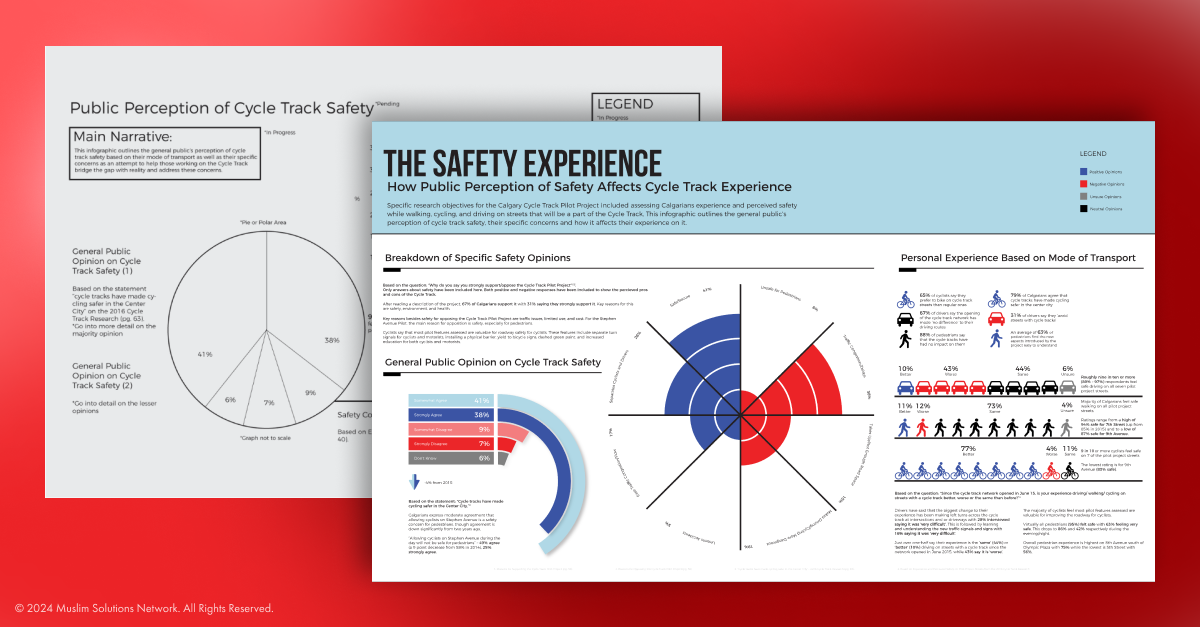
In my second year at university, I collaborated with the City of Calgary to create an infographic for the Downtown Cycle Track Pilot Project. I focused on public perceptions of safety on the cycle tracks, exploring why Calgarians felt concerned and how this influenced their likelihood of using the tracks based on typical transportation habits.
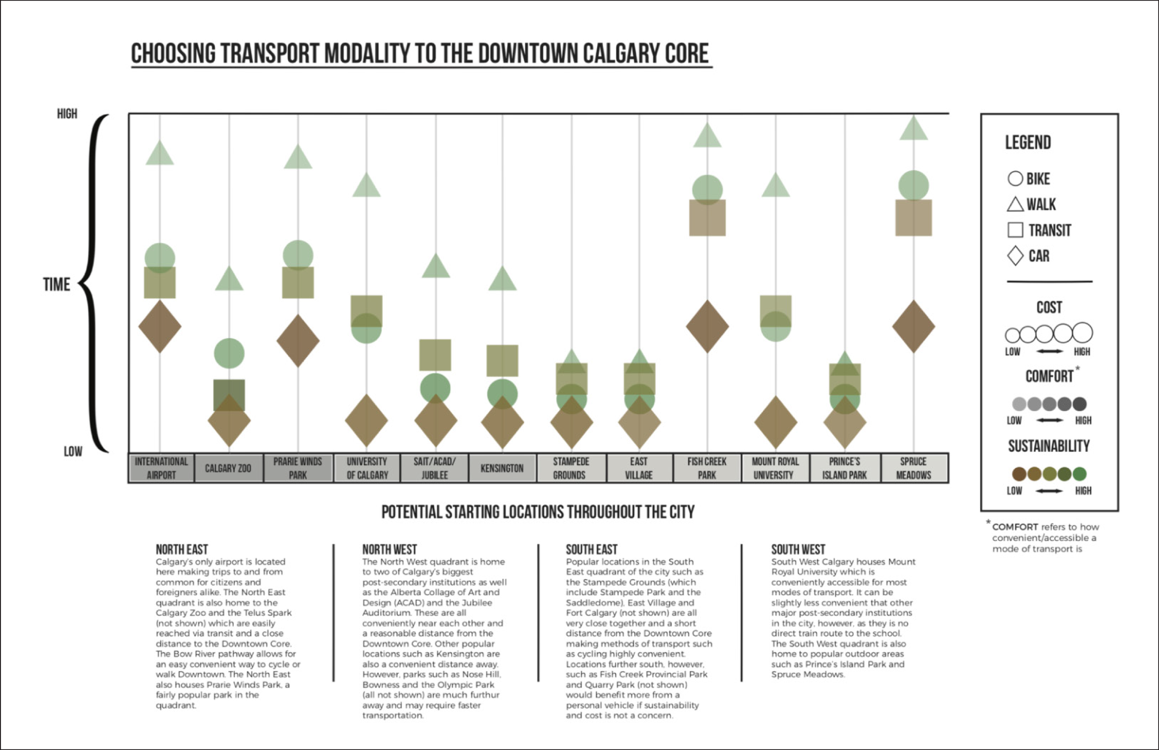
Research drew primarily from the City of Calgary’s census data, supplemented by 311 requests. I first compiled the data into a system map to identify patterns and craft a narrative. From there, I honed in on why residents chose specific modes of transportation and how their perceptions of cycling compared to traditional commuting options—ultimately highlighting safety as the key factor affecting the overall experience.
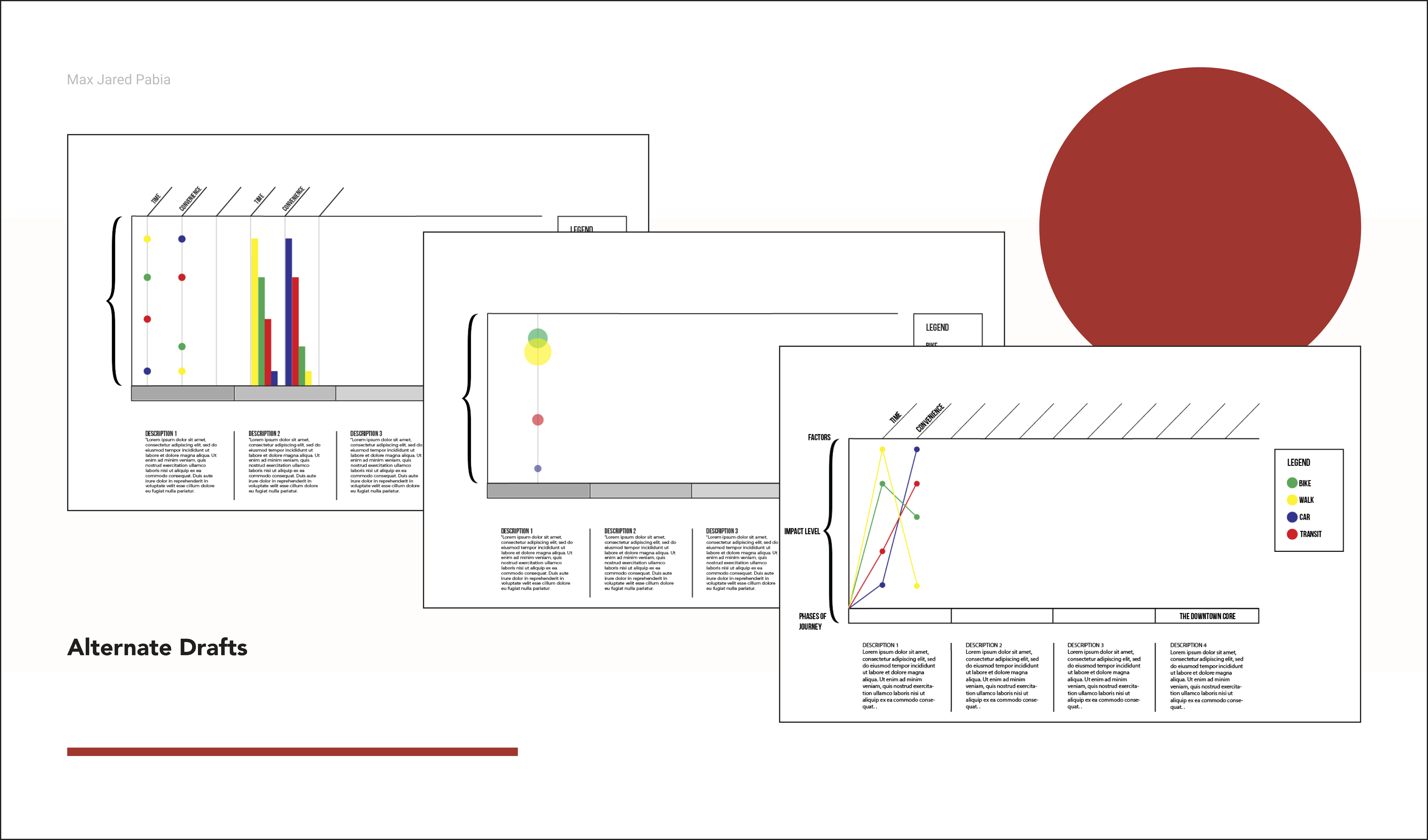
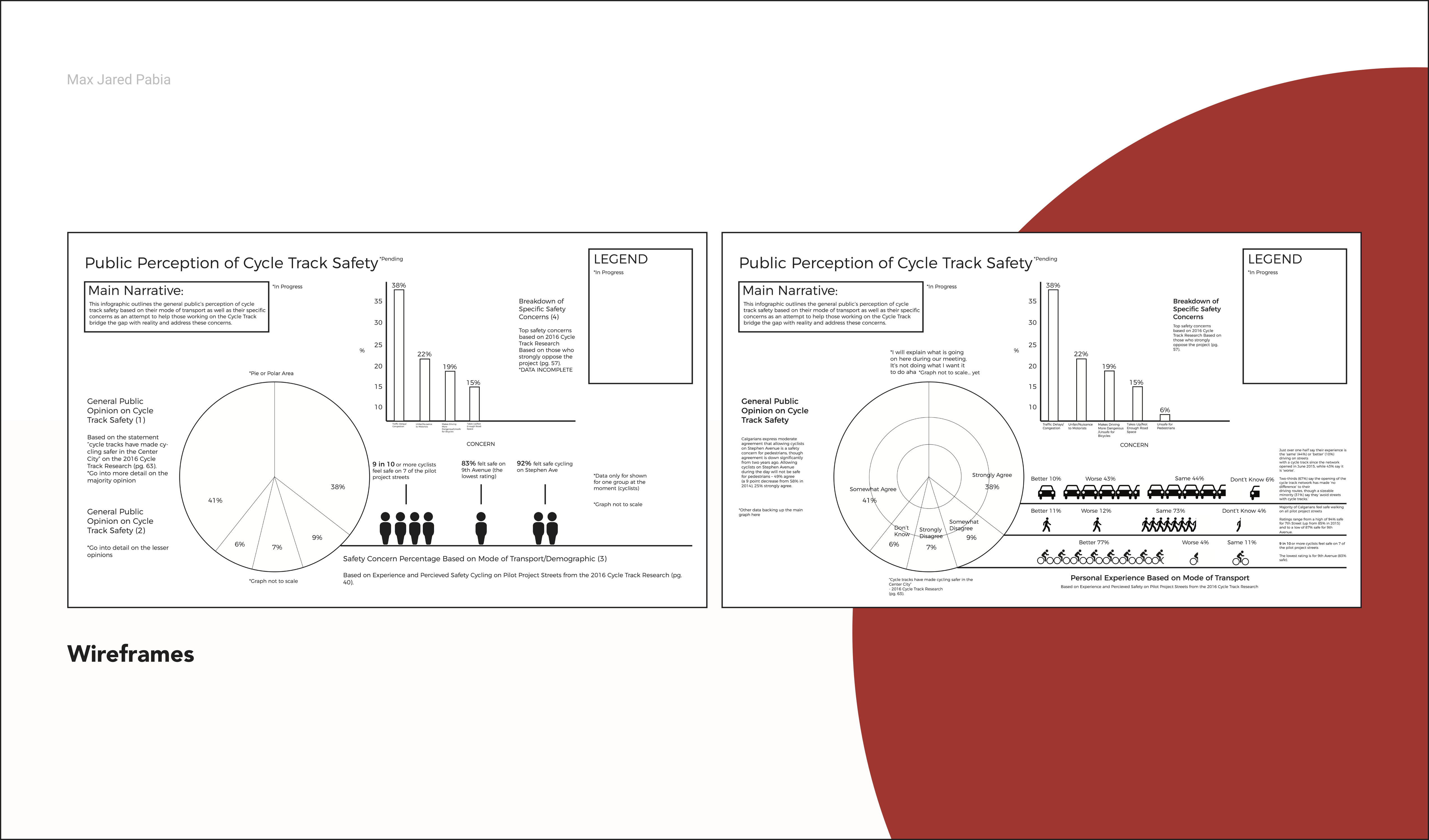
Before diving into research, the first step was crafting a narrative. This helped communicate the significance of the findings and highlighted the implications of the insights. Presenting the narrative as a system map made it more accessible and memorable.
My narrative focused on transport modalities: Which forms of transportation were most popular, and what were the pros and cons of each? I set the downtown core as the destination, analyzing routes from the city’s four quadrants. Using the four most common transportation methods, I compared approximate commute times, average costs, comfort (convenience and accessibility), and sustainability. Minor variables, like the price of individual vehicles, were excluded to maintain clarity and focus.
I divided the data into three sections: overall attitudes toward safety, specific positive and negative concerns—which became the focal point of the infographic—and how these concerns compared across other common transportation modes.

Learnings:
With the project’s budget and deadlines, I only had access to the city’s existing data. Looking back, I think adding qualitative insights and hearing users’ stories firsthand would have made the infographic more personal and engaging. With what I’ve learned since then, I’d also rethink the storytelling to guide viewers more smoothly through the three sections. I’m still happy with the overall look, though the system map could use a visual refresh. One thing I realize now, but didn’t back then, is the value of documenting design decisions from the very start. Doing so would have made writing this case study much easier!
Results:
The infographic was presented at the Calgary Municipal Building on April 19, 2017.
