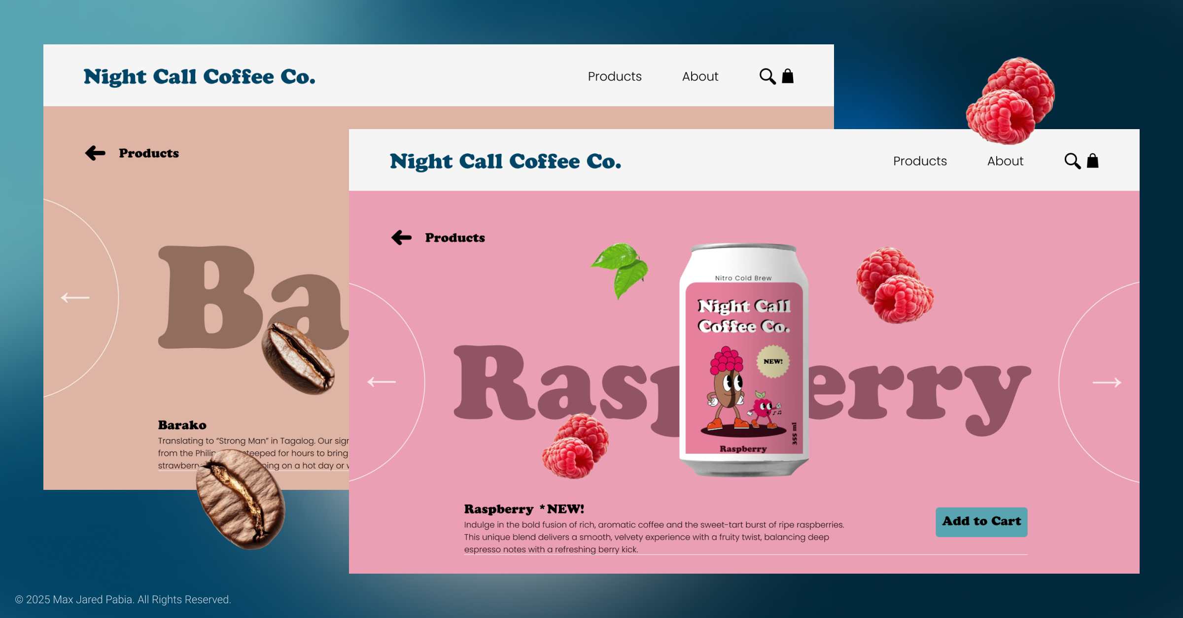
Undertaken as a personal design challenge. My main goals for this project were to practice implementing animated elements into a design. And to include illustration, which is a personal hobby of mine, in some way. This all culminated with me creating the website for a fictional beverage company. I am particularly fond of how animation is used in Discord's website, so initial inspiration was taken there.
The first thing I did was conceptualize the brand. I always wanted to center the visual identity around a mascot character. A big inspiration for this was the "Rubber Hose" art style popularized in old cartoons, and as of recently, in videogames like Cuphead. Understanding what made this art style unique and what gave it its lasting appeal was important during ideation. I tried to capture this style as accurately as possible, which of course, took some iterating. (I admittedly added an extra finger in early sketches.)
.png)

I envisioned the product being aimed towards gamers, creatives, content creators, etc. The same target audience of something like Gamer Supps, but as a coffee drink instead of an energy drink. The name came from the song "Nightcall" by Kavinsky, with other options being Night Run, Night Runners, Midnight Run. I wanted the name to represent late nights gaming with the gang, putting those finishing touches on a creative project, or any time you need to burn the midnight oil. Hey, Midnight Oil actually isn't a bad name either.
.png)
Challenges:
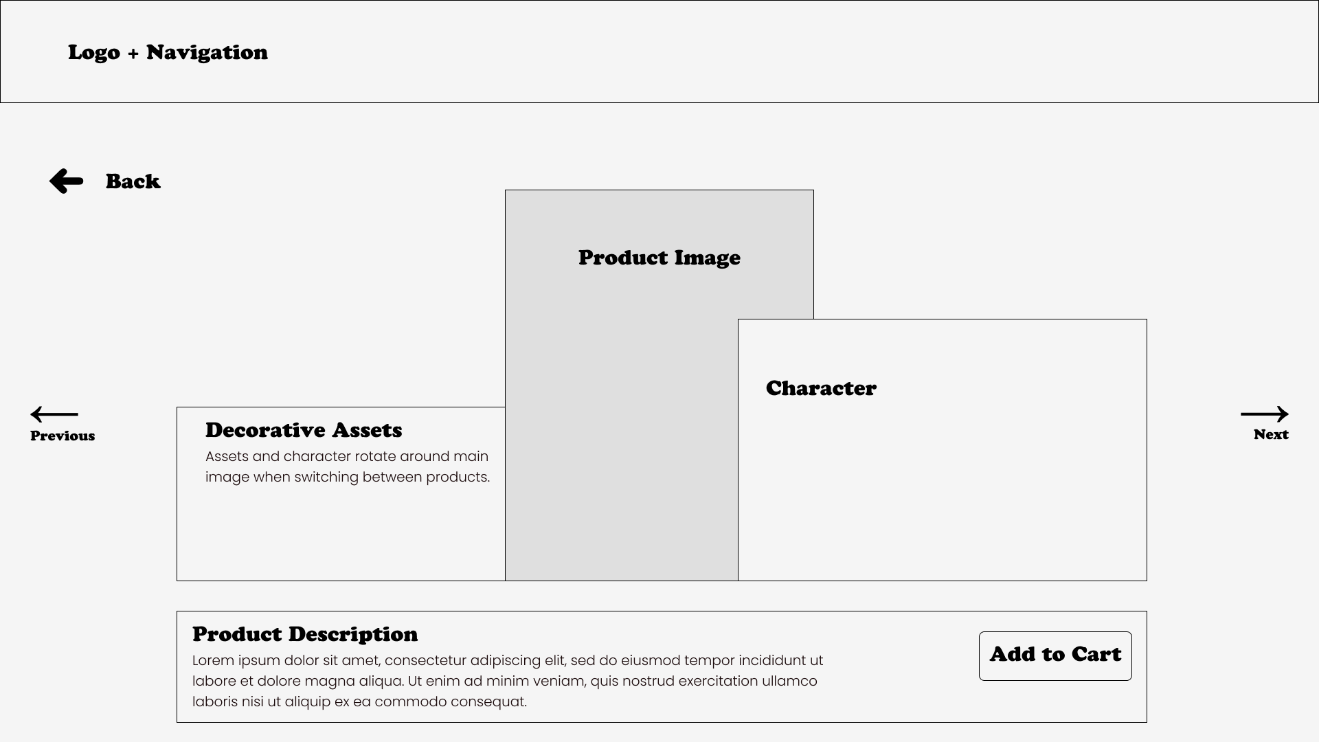
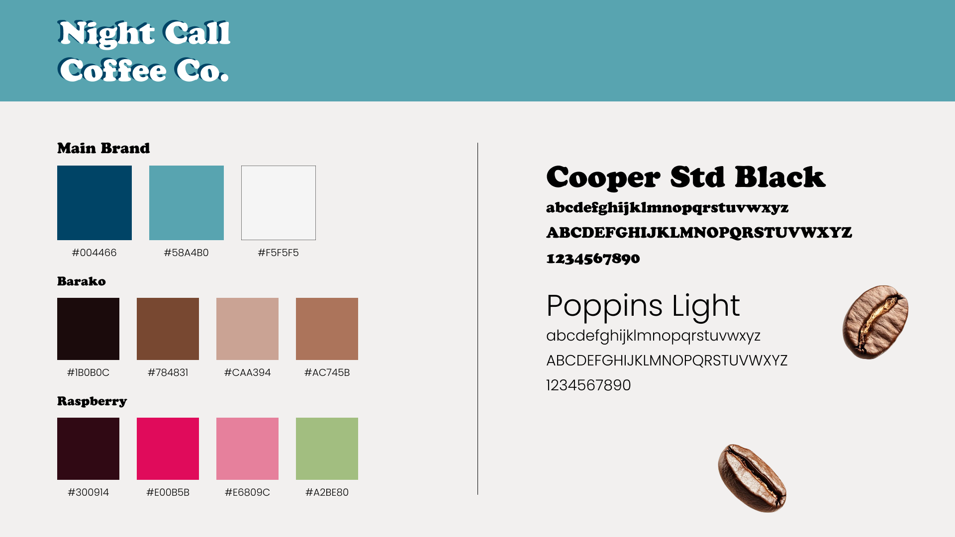
One challenge I noticed right away was optimizing animated components on older systems. I tried running the prototype on an older Macbook and no surprise, there was a bit of lag when switching between products. Adding the option to disable moving elements would make sites like this more accessible to those who don't have access to newer or more powerful systems. Looking back at the design, I also feel that I could have captured the “night” aspect of the brand a bit better. Playing around with colours is one way I’ve tried to remedy this.
Results:
While I am happy with the final product, there's still a lot to learn and so much potential that can be achieved with this. I've always loved drawing ever since I was a kid. I still remember doodling Dragon Ball Z characters in my notebook during class. While not a great idea then, it was these experiences that made me decided to pursue a creative career. So seeing my drawings like this is some ways a dream come true. I want to continue experimenting with motion design, hopefully further implementing it as a mainstay in my portfolio.
.gif)
